
Why are we fascinated with the intersection of time and space??
A couple posts this morning caused me to take a step back and consider this larger question. I am fascinated with the 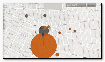 visualization of the relationship between time and space. I used GIS tools kludged to allow for change over time in my MA work on hotels in late 19thC Guelph. Things have since evolved in wonderfully new directions. Visualizations have become increasingly rich in animation, detail, and creative approaches to adding two non-flat, non-static dimensions to flat and static media
I was taking a look at outside-in’s blogger maps. They connect blog and traditional media coverage with a map to illustrate quantity and frequency of commentary in specific locales. Their map of Brooklyn buzz showing neighbourhood areas and the frequency of their mention in local blogs versus traditional media is actually quite stunning. At its simplest it is little different from the grandfather map of spatial representation of cholera outbreaks in London by Dr. John Snow. Snow however was able to pinpoint a particular well as the transmission means for the cholera outbreak. A direct link between reported cases and the day to day activities of the victims. The use of moving pie charts in the modern maps showing the balance between traditional versus blogged media is a great visualization choice. But does it tell us anything without understanding the context of what is being reported?
I have blogged previously on Kevin Lynch’s mental maps and their is a clear indication in the media map of a neighbourhood of spatial perception of a neighbourhood. This is also true in their blogger map of kottke.org, which provides a moving map mash-up of the individual locations of that Dan Kottke has blogged on. You can see his focus shift, but the subject of his focus is not entirely apparent, even with the smooth reference and citing of the stories below the map. The map also collects other references to this same location and charts the result. I am a little unsure as to why a spot reports 1 story by Dan and 9 stories by others and then gives him 25% of the pie, but I am sure they are measuring something subtly beyond my ken.
The concept of tracking conversation in and about specific locales is quite fascinating. I am not sure it is neighbourhood focused, and outside in is probably a good way to describe as this seems as much externally faced as internally interactive.
Does the ability to see time and space simply give us a God’s eye view and make us feel empowered? Tracking local blog activity about localities is very cool in concept. It’s putting some great data out there for us to consider in figuring out what we are actually witnessing. It’s very raw. Can we measure how these stories influence one another and start to gauge who is writing about what they read? More so, can we start to peg these stories to concrete action?