
The number of tools, add-ins and routines to generate your own data visualisations seems to be evolving very quickly. I use the single little spark stats WordPress plug-in to keep track of post frequency on Randomosity. when I first was playing with sparklines, I downloaded a shareware version of Bissantz SparkMaker plug-in for excel and there was also a similar higher cost tool available from Microcharts. I know that Bissantz has 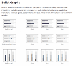 been constantly tweaking his tools and they have become more powerful. They are nice tools and should command a payment. I certainly do not begrudge. Microcharts seem to have evolved even faster. I happened to be doing a little walkabout to see where things in the data viz arena were at and when I saw the latest Microcharts/Pro, have to admit to being floored.
Microcharts Pro offers a wide range of highly customizable sparklines inspired by Edward Tufte’s work as well as the increasingly popular bullet chart from Stephen Few (I will admit to being rather fascinated by the bullet chart right now). Microcharts is aimed at the dashboard developer and provides a way to rapidly implement an effective digital dashboard. They offer a Standard and Pro product that open up a huge variety of ways to represent data as their tag line says.. “through charts reduced to the max.” There are demo versions of products available from both Bissantz and Bonavista Systems.
I will have to try the latest versions and see how the evolutions actually empower the user. As with any such tool, knowing how to best harness the tool and be able to decide on what visualisation is most appropriate to the message still remains the key. I am reminded, most simplistically, of all the resumes written using Apple’s kidnap letter-like San Francisco font in 1984, simply because they could. Books such as Few’s ‘Information Dashboard Design’ or Niederman and Boyum’s ‘What the Number’s Say‘, are two useful tools to thoughtful data presentation.
Update: Note the revised Microcharts pricing that Andreas Flockermann forwarded as a comment. Like SparkMaker, there is a free version for educational and not for profit use. Hopefully appreciation of the value of these tools will incent users to upgrade to the Pro versions.
>>there was also a similar higher cost tool available from Microcharts.
Here an update on the MicroCharts pricing:
MicroCharts is available
• for free for academic use and non-profit organizations,
• $ 49 in the Basic Edition (all chart types), and
• $ 99 in the Professional Edition (all chart types in colors, bullet graph),
That makes MicroCharts the cheapest Excel sparkline tool in the Market.
hey guys, I have found Sparkline charts for free, thinking where? look out for visifire offered under open source just for free powered by silverlight
Hi there is an open source free alternative to Sparkmaker and Microchart for Excel 2003.
Check out : sparklines-excel.blogspot.com or search for sparklines on sourceforge.net.
It consists in an excel template file, containing User Defined Functions for lines, bars, pies, bulletcharts, scales, heatmaps and more.
Regards