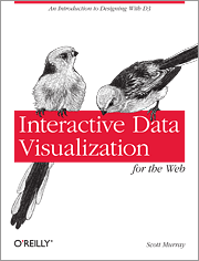
 Interactive Data Visualisation for the Web by Scott Murray puts you in the seat beside a data vis master as he takes you from zero to a solid comprehension of the thinking behind d3.js – a popular framework for visual data presentation. D3.js is all the rage and the underlying framework behind many compelling interactive data presentations making the rounds in the net media today. The thinking behind d3.js (yes, d3 stands for data driven documents) is a logical layering that binds data to screen display and allows you as author to give your consumers/readers the ability to explore your data to derive their own findings. Logically this book does something very similar. Imbued wih the d3 ethos, Murray provides a very solid (and welcome) overview of the DOM, its constituent parts and the handles that have been put in place through HTML and JavaScript to utilise the modern browser as a data analysis and presentation tool. He then takes you through a gradual step-by-step process of showing you excatly how to take your own data and use d3 to construct simple but powerful interactive visualisations.
This new volume is richly hands on and assumes little or no prior knowledge of web technologies – aside from a willingness to engage and work through the step-by-step exercises provided. Murray introduces the volume with a comprehensive but concise discussion of HTML, CSS and JavaScript. As a point of information it’s interesting that an author ‘forced’ to quickly cover core topics such as this does such a fine job being constrained by space, focus and a desire to move on to bigger things. Books dedicated to the minutiae tend to fulfill their own ambition and often devolve into deeply philosophical refections – as though compelled to become a book when a mere chapter would suffice. Basics should stay basic. OK, end of tangential comment.
Interactive Data Visualisation is focused on d3. There are many other frameworks out there for accomplishing the same tasks – and very thoughtfully the author even lists a series of them. A definite strength of this volume is the healthy number of references provided throughout and at the conclusion for future exploration of the data visualisation in general and also to continue down the d3 line. The few chapters in this book progressively introduce you to d3 concepts, building on each and providing extensive follow-on samples. All of the JavaScript is thoroughly dissected, files are made available for your own deconstruction and the small steps keep you from being overwhelmed (as I so easily am). The style of prose is familiar and blends just the right amount of humour to make the instruction feel personal and keep you engaged.
At 250 pages, this volume is more than a quick introduction, but far less than a reference manual. It is the equivalent of a day-long instruction session introducing you to the power of d3. The author concentrates the instruction on building a very simple visualisation using a bar chart, that although simple, allows for a wide exploration of the concepts behind d3. He touches on how these concepts can be extended logically into pie, donut and force-directed displays to demonstrate the extensibility of d3 and then looks at how GeoJSON data is usefully handled through d3 – tipping his hat to the geospatial turn in data.
I worked through the bulk of the exercise provided and the format lends itself to having your bowser open along with an editor saving your changes to an active document on your web server. The small steps are immediately visible and reaffirm your confidence with the framework. I found that this introduction (completed after backwards engineering many d3.js examples) really helped to give me some of the ah-ha moments of clarification of what I had not quite grasped when trying to work with pre-constructed visualisations. Both of these approaches though seem to work well together.
This is a highly recommended volume and along with Nathan Yau’s superb Visualise This, can serve as superb data vis hands-on instruction courses. Both very well paced and full of helpful, well constructed samples. I would recommend this for novice to intermediate usage and seriously consider using it in my next information visualisation workshop.
