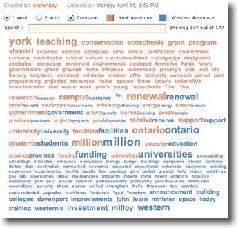
Taking a look at a chart of common words and their frequency of use is a first attempt at this.
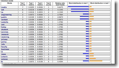
A similar chart was created showing me words that appeared only in one or the another and I was immediately struck by the fact that campus didn't occur at all in the McMaster announcement, where it was the most frequent word at Guelph. ... By choosing to upload only the text of the announcements themselves (And thus help the tool know just what is important to me) I can get the results I want to consider.
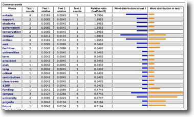
Voila! ... I want to consider this further, but I am far more a visual thinker, and while these bar charts are pleasing, and take a wealth of data and distill it to a very nice summary, I want to take it one step further.