
 More a caution than a critique, I was fascinated and left to ponder Peter Liu’s time-based spatially informed map presented in the MapBox Blog this week. I think that the concept is absolutely sound and the implementation is skilful, thoughtful and very efficient. It’s an impressive conceptualisation of how to rethink data representation for a particular decision-making process. That being said, it is probably important to realise that it calls for considered appreciation of the thought behind it and how we can take advantage of interactive way finding technology and not lose sight of the varied ways we get from A to B. Liu’s blog post is a very well articulated explanation of the thinking behind the reconnection and we need more of this sort of thing. But it raises some serious questions about technological dependence and critical engagement with the data we rely on today.
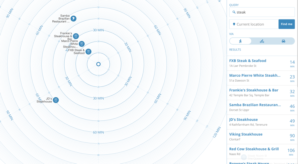
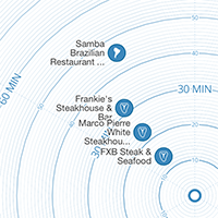
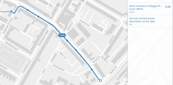
Liu introduced a slick interactive wayfinding system combining the touristic ‘what is within walking distance of this point’ map, with more realistic intelligence that plots real walking distance based on way-based rules. To further expedite the decision-making process of ‘how long will the journey take’ to a series of destinations matching criteria, the visualisation removes distracting spatial information (excepting cardinal direction). This is thoughtful and makes for a very clear and efficiently presented dashboard. A user can choose from a list or the visualisation and then get a series of wayfinding directions.
Check out the tool by clicking on the image – it’s great!
This is great. If the only criteria is time to reach a destination – in effect a unidimensional rendering of a decision. After playing with this for awhile I two thoughts came to mind.
Complexity for the sake of Simplicity
The first is in how slick this way finding aid is, but how dependent it is on a vast collection of frameworks and modules – a complexity that delivers a great results, when everything works. However, it is a level of complexity that raises the likelihood of the entire system failing with the smallest module outage – and more modules means more chances of failure. It’s unfair to lay this at the door of Peter Liu – this is a great application – but it raises a huge question in my mind about the tools and technologies that we have come to rely on today that are great when they work, but are increasingly dependent on elaborate networks of services – beyond local control. Failure of any component reduces the utility to zero – not unlike the most advances smartphone with a dead battery – the utility of a doorstop (if that). More and more of the things we interact with on a day to day basis are far beyond the ability of most of us – and in fact this exactly what many of the producers of same tools want – one the reasons behind the Steampunk movement.
Simplicity for the sake of Efficiency
The second challenge to me is an ever bigger one – the system is slick, and gives me what seems to be a well informed answer so easily and quickly that I trust it to be the right answer. Dashboards by definition attempt to summarise, aggregate, simplify and there has to an implicit bias in the rules and process undertaken to accomplish this. Good practitioners seek to make those assumptions and algorithms transparent to be honest and true to the data, but even the data can be flawed by the collection process. The slicker the tool, the more sophisticated the visualisation (and often perceived simplicity gains authority) the more we have come to trust in them.
But what if the journey is actually the reward?
It’s intriguing in this visualisation that it reduces the dimension considered only to time to destination and in so doing eliminates all other variables from the choice that a way finder may want to consider. I reiterate that this interactive visualisation is not wrong at all and in fact, superb at what it does. It is just that as a user you have to be very much aware of the variables that have been eliminated on your behalf to make the process simpler and more efficient. In the case of ‘locating’ possible destinations factors such as danger, pollution, noise, scenery, temperature etc, could all be as if not more important than getting there at a particular point in time. Moreover, it also ultimately pushes us towards getting to a place as quickly as possible and possibly unconsciously making this the underlying factor in all our decisions – missing out on the value of the journey to get there in the first place.
Peter Liu’s interactive visualisation is superb and does what it claims to do in possibly the very best way possible. It simply reminded me that sometimes the simplest way is not always the best way and as we continue to embrace complexity and yet crave simplicity we possibly become dangerously addicted to technology increasingly prone to failure and subject to hidden assumptions that we are less, and less aware.
As I said, not a critique at all, but merely a cautionary tale. Step back and think about what goes into the thoughtful and well considered technological simplifications that we demand – that may or not be delivering completely informed technological utopia we think we getting. Step back, enjoy the journey but think about where it might be taking you.