I am sure I should have seen this before. Findproperty.co.uk is amazingly integrated property locating service that utilises seme well-crafted data visualisation to provide access and context to data – and ultimately to inform the property location process.
In 2008 when I moved to Dublin it seemed natural to me, given what it is I was doing and still do, to create a mashup of data to find a place to live. I scraped data from daft.ie (there was no API) to provide rental property prices and property specifications. As daft.ie at the time lacked a geospatial presentation, I used Yahoo Pipes (since deceased) to create an interactive map using Google’s offering. This was serious rocket science (at the time). Shortly thereafter, maps displaying selected datasets on property sites became commonplace.
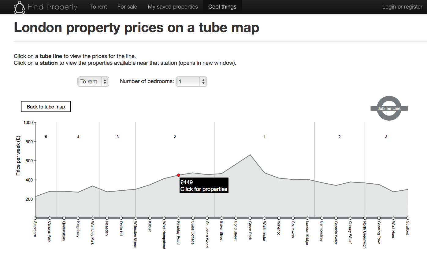
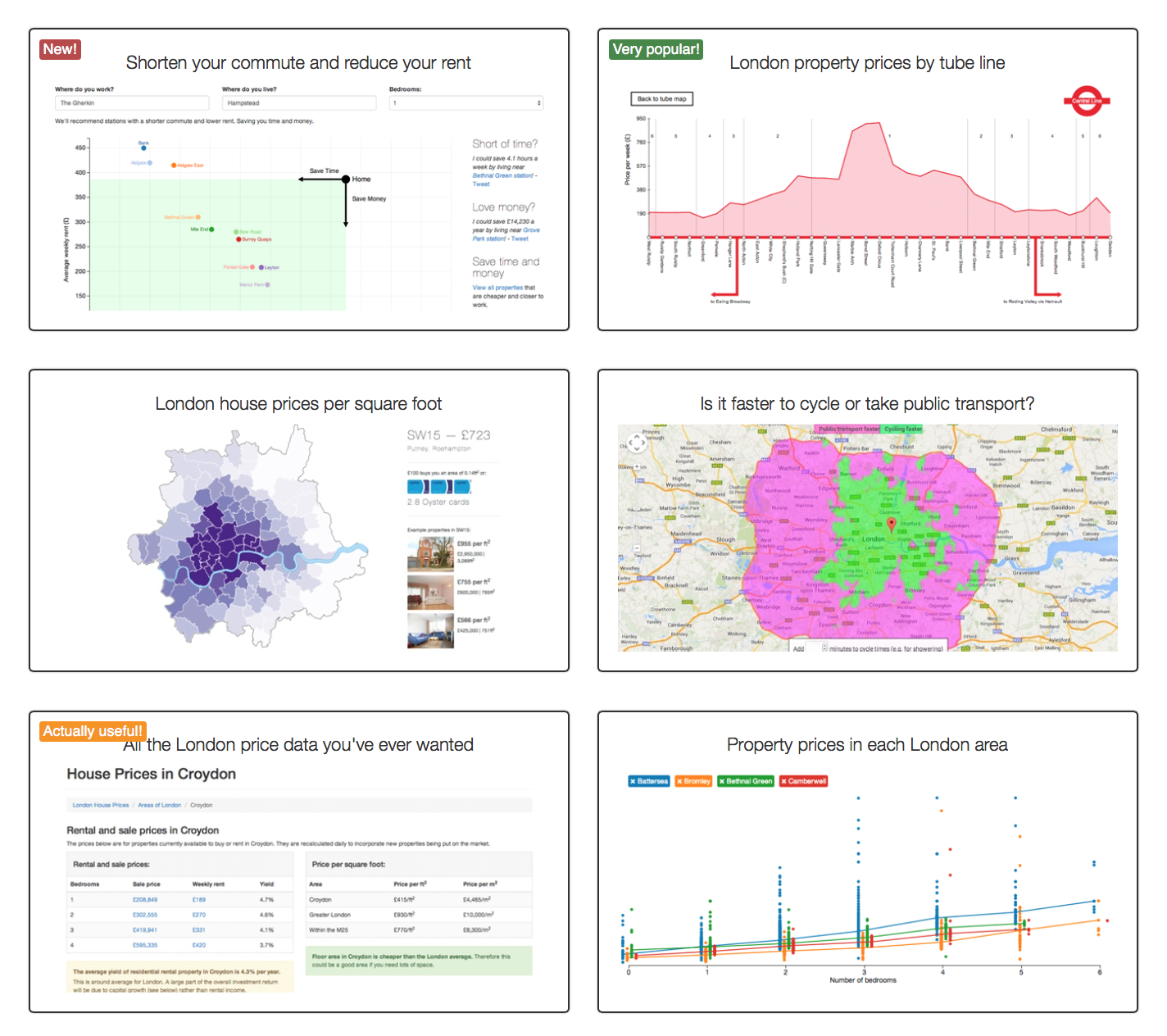 Today, Findproperly.co.uk takes into the beyond, by mashing on additional life logistical datasets and In the specific case of what caught my eye today – mapping property prices to the London Tube Map. I was impressed to see a static map this morning showing the tube map with median property values attached to tube stations. Neat. Cool enough. Tracing back to the Findproperty website I discovered massively interactive and impressive data visualisations that approach the property search from multiple vectors (quality of life metrics, commuting distance, public transit use, even cycle routes. All are available under the appropriately denoted menu item ‘Cool Things’! I love that they qualify the cool things as New!, Popular or Actually Useful! 😉
I was blown away (as I am sure I won’t be in a few years time 😉 by a tube map that you can view as either Beck or geographically accurate and then after selecting a tube station or line, presents you with qualifications to suit your property needs. Selecting a line takes you to a further visualisation that extracts data for that line or station immediately displaying 1 bedroom rental property media prices on an interactive area chart. You are invited to choose to rent or buy and adjust the bedroom count desired. The chart morphs as you make choices. Choosing a specific locale then takes you to the properties fitting those parameters.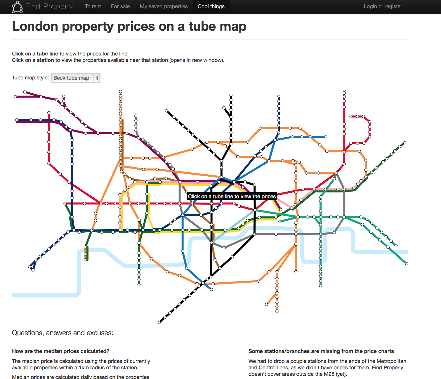
This unique interactive visualisation doesn’t just expose data visually and allow you to narrow down your parameters to find the fuller information – it combines multiple datasets and allows for multiple perspectives of the ultimate section criteria. This is most powerful and the developers of this site have done a superb job of thinking like their users (buyers) would think and have crafted the interface to the data to suit these thought processes. Very, very cool and well done.
What if similar processed could be applied to data catalogues in academia?