
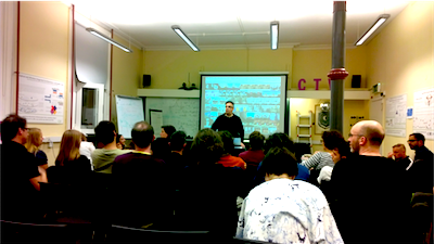
I was thrilled to attend a presentation by Lev Manovich at the Trinity CTVR on the 6th Sept on ‘Cultural Analytics: How to use big data to unlearn what we know?’
 The experience was inspiring and enthralling and my thanks to Karolina B for passing along her ticket. Manovich reviewed a number of his more prominent projects ranging from earlier work visualising large (and complete) collections of magazine covers and magazine pages as reflections of social culture. He also shared more recent work exploring image data from social media to identify similar cultural patterns and to disctinguish between the way in which ‘social’ media is constructed.
Manovich’s project material is publicly accessible at: softwarestudies.com
One of the more telling and pithy remarks was his explanation around how exploring the dataset becomes a medium for thinking, reminding us that the exercise is not just to find new deductions, but to question what we think we already know – that is, to discover patterns that contradict what we might have assumed.
 The underlying ethos at software studies has been to attempt to bring programmatic techniques to a popular level – to feel comfortable to employ the techniques without having actually taken a formal course in the discipline. Ah ha .. a possible suggestion as to why Manovich naturally seems bring a disruptive approach to working with data – how his fresh thinking adds to the discipline – lacking any restrictive or dogmatic ties to existing and past practice. This also allows for the rather bold introduction to his talk – a challenge that the discipline of data visualisation still rests on practices and forms developed during the late eighteenth and early nineteenth centuries – and may well be outmoded for modern practice. He asks why we are still using these techniques that responded to vastly different set of social and political circumstances and needs than we find ourselves today. An easy answer (and not necessarily invalid one) is that they have stood the test of time and still retain some validity. However, Manovich’s contention is not the sample path and through his work he seeks to ask the hard questions of our basic assumptions and attempt to overturn some of the traps we might fall into without thoughtfully questioning what the particular visualisation actually returns to the process of discovery.
Manovich points out that the ways of seeing data arise from initial forays into the study of social statistics and the development of the bureaucratic state. They rest on a process of reduction that attempts to simplify trends by throwing away data to allow for comparative study – discarding 90% of data to allow us to compare 10%. Manovich has adopted a distinctly different process that asks us to wonder how different things may look when we attempt to work with complete datasets. Therefore, much of his work has sought to find means by which simple human minds can comprehend these massive datasets in a visual fashion.
He defines two related but unique processes, that of information visualisation ( data into pictures ) and his field of media visualisation ( pictures into pictures ). The point here again seems to be to realise that reductionsim is a human trait and we have to constantly be aware.
He warns that the web kills many great ideas because we are constrained by current platforms and available ways of manipulating and displaying data. There’s no easy way around this and he’d be the first to admit he benefits from having a diverse and rich set of resources to draw upon when attempting to think outside accepted data visualisation methodologies.
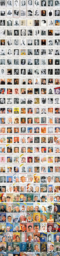
One of the more prominent examples of Manovich’s research is a particularly compelling collection of all the covers of TIME magazine since the magazine’s inception. Mapping TIME, displays all covers of the magazine as a a time ordered series. Manovich asks what we can tell see in the patterns displayed in light of how they reflect the nature of the culture that produced them.
One of the most obvious notes surrounds the introduction of colour – but more intriguingly we can also observe changing cultural preferences around colour … it become particularly intense during times of crisis, featuring a predominance of particular colours. Through the constructed visualisation – and the note here is that he uses a tool as simple as PhotoShop as his visual navigator – the participant/researcher can zoom in and out to discern different patterns at different scales. Patterns of communication change over time.
In early days TIME magazine covers uniformly feature important figures, largely male. There are no backgrounds and the black and white portraits rest on a stark white background. There is less attempt to convey overt code in the composition. Over time this begins to evolve and the introduction of colour also parallels a process of more diverse gender feature as well.
The 1940s represent for Manovich a ‘second modality’ when the backgrounds start to tell stories. Portraits of individuals are now placed in relief over a carefully constructed (often iconic) graphic narrative, by the period 1980-90 – people continue to appear (but with less frequency and incraesingly become neutral) as the cover itself becomes the story. In all of this work, the covers are represented as they were printed, arranged into a vast massive tapestry of unretouched glory.
The 2nd visualisation process that springs from Manovich’s quiver is to process the images and to extract statistics from the image compositions and represent them as numbers. In all the examples of his projects it is this seeing as a whole and being able to appreciate a complete body of work that emerges. He provides unique image analysis metadata through the analysis of compositional features: Is there a face? are multiple faces? are smiling? frowning? how is the head tilted, how much foreground? How much background? Images are then sorted then based on the extracted info. Play the game and look at outliers…why are they there?
Interestingly during wartime, there’s heavy colour saturation on TIME magazine covers and it then appears again in the 60s. What is the cultural connection? Do crises inspire unmistakeable communication forms? There seems to similarly heavy saturation for ‘dangerous’ things – including the presence of women on the cover in early TIME’s.
As any good statistician looks at std deviation – a potential measure of deviance from a ’norm’ – in TIME, there is very little spread. However, over the next few decades the spread grows and is then constrained again in 1970’s. Much can of course be attributed to particular graphic styles or personalities and that of course if the point – connecting culture to its visual manifestation – one that may not be evident by looking at single objects in isolation.
A second series of visualisations goes beyond the covers of magazines such as TIME and instead takes every third page of every issue from Popular Science and Science Magazine for the first four decades of publication. Again, the pages are displayed in a chronological fashion. For the purposes of demonstration, Science is arrayed against Popular Science. What is immediately and possibly counter intuitive to our assumptions, Science Magazine features far more illustrations than Popular Science. Strangely it is observations such as this that are made visible by ‘seeing’a collection in its entirety. There is an eventual evolution and switch in the balance of use of illustration, in the case of Popular Science it happens very suddenly and actually stems from a change in ownership and aggressive marketing. Science on the other hand goes into a far more text heavy presentation style currying the changing favour of the times for being more authoritative.
In a project to explore the work of impressionist painters, he ponders what happens if you see impressionism in one image? That is, if you pop into a book you’ll typically see a few pictures pictures – but not all – what happens if you see them all? In this project he collected over 50,000 images and compiled and attached his typical image analysis metadata to the paintings. One of the interesting findings is simply that although we have a sense of what impressionists paint and we see as impressionism as a result. Regardless, as becomes clear when seeing in entity, a very significant proportion of the oeuvre of the school in fact includes paintings that simply wouldn’t be qualified as impressionistic. When looking at bodies of work one can far more easily see the change over time and it doesn’t tend to happen over night. Again and again what Manovich reaffirms is that we arrive with preconceived cultural assumptions that by using non-reductive techniques we can thoughtfully reconsider. The whole object is that if you reduced – you’d miss the patterns. Its only in seeing them all at one that you see particular patterns.
A phrase that Manovich casually threw out here was the whole idea of ‘software as a media for thinking’- now there is a loaded and valuable avenue of consideration for the DH community. As he says, when working through the algorithmically driven visualisation, if he is inspired by something that emerges he can change the code to explore a new vector of investigation.
His investigation into moving images ( Visualising Vertov ) is challenging as it is somewhat recutive in nature itself by taking the moving (and although constrained by frame rates to still images) images and choosing selective frames. Nonetheless in looking at scenes by compiling start and end frames and seeing these all at once as opposed to as the director intended, new questions emerge of the creation. In the instance of Vertov he asks, does the lack of camera movement infer that the director is trying to constrain message – a fear that differnet composition changes message?? The same of course is going to be turned on Manovich after inspiriting us to appreciate his own approach. What the dynamic visualisation of film does for Manovich and his group is to allow them to look for motional and visual structure by looking at all scenes in film at once, in a sense mapping the film and seeking hidden digital artefacts
Manovich’s work with Selfies ( Selfiecity ) was published late last year and received a lot of attention. The initial question asked was: who takes selfies and where are they? Will we see cultural differences evident between cultures taking the selfies or will it become a uniform form of expression in itself? Good question. Ultimately he concludes that selfies have become a new type of cultural genre entirely predicated upon technological affordances. The collection of selfies from Instagram did lead to some intriguing if not entirely connected aspects that Muscovites tend not to smile that much when they take the selfies, to the massive use of image enhancement in Bangkok as well as very interesting gender usage differences with Bangkok in especial where the majority of selfies are by males where it is females substantially elsewhere in the cities being studied.
In a followup project – Phototrails – Manovich and his group compiled Instagram pictures and visualised them as mosaics. Metadata included angle of capture, distance from centre, resulting in over 50,000 from a selection of cities. As in previous examples, images were visualised and clustered by angle, by average hue, and average brightness. Again the tool is not going to discover, but create patterns. The result of the mapping is further filtered the based on type of composition and choice of the Instagram filter. The use of filters was one of the main demonstrable differences between cities – where in fact the heaviest use was in NYC, where over 79% of the images uploaded to Instagram have a filtered applied …the big question is: what does this say about New Yorkers? Does it have anything to do with the interface and proximity of buttons, use of language versus iconography …or what?
What Manovich goes to length to emphasise is not that there are patterns, but that there are differences to what we might expect to find. Where we would assume that people might do similar things we find they do things differently and it is this difference that can most easily be obscured through both our tendency to reduction and devotion of visualisation techniques developed 200 years ago.
Manovich’s most recent work collected Instagram images from Kiev ( Kiev Instagram Project ) 19-21 February this spring. He collected both the images, their location metadata and finally the tags that chosen during the spring revolution in Kiev. Manovich’s group ask: what images are shared – not how protestors used it, but instead when something important is happening, what are people doing? This is an interesting perspective. After a few years of focussed discussions on the perceived massive impact of social media on political expression and seeking to discover evidence of its impact, Manovich takes a different approach in attempt to avoid arriving with preconceived notions of use.One of the findings when exploring the collection of Instagram uploads is the fleeting nature of local attention. There may be a spike in attention to an occurrence but the attention is generally short lived and returns to a global awareness in a relatively short time.
Thanks very much to the staff of the CVTR and to Lev Manovich for a most thought provoking evening.