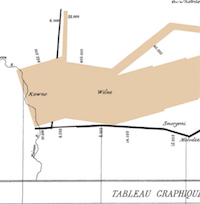
 The rather innocuously titled ‘Visualising helps make sense of data‘ by Teresa Tocewicz crossed my radar this morning. It’s a short, succinct piece that doesn’t raise any contentious ides, instead reinforcing and reminding why and how we approach the visualisation of data in digital humanities scholarship. Online tools have made it easier than ever to present data in compelling visual creations – something that should send shudders and set off warning alarms. Much like the deluge of data, we have an accompanying profusion of infographics that still hold huge authority for the quality of production, but can fall down for the lack of thought and professional consideration of the impact and the ways in which we communicate visually.
She identifies three specific tools that are of specific note:
- the JISC InfoKit on data visualisation: a great overview and beginner’s guide;
- the Graph Selection Matrix from Perceptual Edge: a when to guide for matching your data to the intent; and
- the Nuts & Bolts of Chart & Graph Types: a clever visualisation of visualisations finding a topology for sharing intelligence around the use data vis techniques.
One of the continuing most useful ‘tools’ to emerge from this ongoing discourse though is the series of tips that emerge from someone that is thinking deeply about the power, authority and far reaching implications of the prolific use of data visualisation in humanities scholarship. I have in the past made much of Tufte’s Visual Display of Quantitative Information (summarised nicely by Mike Pantoliano) and that from Fran Helper (Seven Guiding Principles). Adding to these are ten great single tips, some of which echo these others, but reinforce and remind us of the simple but profound things to keep in mind when playing with visualisation fire.
Tocewicz says:
- Keep it simple – avoid ‘chartjunk’ at all costs;
- Focus on purpose – don’t try to do everything with one visualisation;
- Choose the right chart – understand the strengths and limits of each chart type;
- Make use of micro and macro perspectives – think about your audience: are they senior management or practitioners?;
- Avoid information overload – multiple charts are better than cramming information into one;
- Avoid 3D charts – the perspective can distort the data because what is displayed at the front is perceived as more important than the background;
- Amplify the message – use the title to emphasise the main finding in a compelling headline
- Don’t confuse visualisation with data art – the main job of data visualisation is to inform and help someone understand the data; the primary purpose of data art is to deliver an aesthetically pleasing experience and to entertain;
- Proofread – often we focus so much on the numbers that we forget about the words, their spelling, grammar and clarity of the message;
- Use colour sparingly – colours in analytics should add meaning and extra context to the visualisation, not just to make the charts look pretty.
