
I use both GraphViz and OmniGraffle to construct charts involving relationships and processes. Over the last few days I was noodling my way through a schematic of sectarian associations in Northern Ireland. Trying to get the players and organizations straight was simply impossible for me without some sort of visual aid. I did a quick scan of the usual suspects to determine whether anyone already had something that would suit my needs, but only found textual compilations. Although comprehensive, these required more than casual scans to get an immediate sense of who fits where. I put the chart before the horse this time and started drawing on a napkin. I presupposed that I would need to visually distinguish between political organizations and paramilitary ones, and also between religio/political affiliations. The colours green and orange sprang to mind as good visual cues 😉 I was able to access the CAIN database which provides a superbly authoritative compendium of organizations on on ‘the Troubles’ and politics in Northern Ireland from 1968 to the present. Chronology was also a factor and I had an additional temporal dimension to consider. The napkin was overwhelmed.
In many cases these days when I have a nice tidy little dataset, I like to throw it online at Many Eyes and see how it looks. I have blogged a couple times in the past about Many Eyes and remain a fan. Unfortunately at times, their tools don’t quite give you what you were looking for – although they do often give you a great starting point. I did actually throw a subset of the data at Many Eyes to see the result. The really usefult thing about Many Eyes is that I could also take the same dataset and with a couple clicks try visualizing it in different chart formats, such as a word cloud for example. However, the network chart was limited in my judgement (and I know they have a very cool visualization coming, but it doesn’t seem to have shown yet).
My weapon of choice for free-form digital charting on my own machine is OmniGraffle. It’s powerful, intuitive, creates instantly aesthetically pleasing charts and is wonderfully extensible. There is an ever growing library of user contributed templates and charting processes available as plug-ins. Perhaps most importantly, OmniGraffle plays well with others. It can import graphic and text as inputs and similarly output a variety of formats. Omnigroup as well offer educational pricing on their products. However, as I laid out the map, I was in manual mode and although aided by the visual, the growing complexity of the chart suggested that my free-form approach had really skipped the possibility that all this wonderful graph theory that I am vaguely aware of might actually have a role to play.
So, I took a big step back and started mapping the relationships textually before I went too far. I will note at this stage that Bill Turkel published a wonderful post last week on how he used similar tools to visual the emergence of a strategic knowledge cluster – a great real-world application for relationship mapping. His post builds a wonderful case study of an expanding network and how graph theory can be applied to appreciate dynamics that might be salient to actual participants. So how do you star this process?
I wanted to have raw materials that I could repurpose easily to use with multiple tools and also be able to massage as the data itself suggested avenue for further exploration Working in a simple text editor, I created a file using the DOT language. There are a number of ‘standards’ for representation of relationships between data, but I find DOT to be rich and as intuitive as a high level encoding ‘language’ might be. DOT symbolizes a relationship as simply as A -> B and then allows you to elabourate on the relationship and the way in which it is presented. I didn’t want to code in the presentation, but instead, just to have a simple file defining all the parent -> child relationships that needed to be mapped. Social Network conventions term the entities being related as ‘nodes’ and the relationship the ‘edge’. The resulting list in DOT looked something like this:
digraph unix {

node [shape=rectangle, color=orange, style=filled];

"Ulster Unionist Party (UUP) 1921-1972" -> "Unionist Party of Northern Ireland (UPNI) 1974 - 1981" ;

"Ulster Unionist Party (UUP) 1921-1972" -> "Alliance Party of Northern Ireland (APNI) 1974 - 1981";

"Ulster Unionist Party (UUP) 1921-1972" -> "Protestant Unionist Party (PUP) 1960s - 1971" ;

"Ulster Volunteer Force (UVF) 1966 -" -> "Shankhill Defense Association (SDA) 1969 -" ;

"Ulster Loyalist Central Co-ordinating Committee (1974 -)" -> "Ulster Special Constabulary Association (USCA)" ;

"Ulster Loyalist Central Co-ordinating Committee (1974 -)" -> "Ulster Volunteer Service Corps (UVSC)" ;

}
A simple start and as you can see, DOT is not too complex. You put your data between two curlies, keep node labels between quotes and end each line with semi-colon. I eventually added all the organizations that I wanted to connect and saved it as a .dot file.
This file format is the standard input for a product called Graphviz. It was developed in the AT&T research labs and is available as open source. If your relationships have all been coded correctly, you can simply open the .dot in Graphviz and it will immediately render the web of associations that you have created as a chart. Most of the time, the chart will be just what you need and concentration of relationships, or key nodes in the web will be immediately apparent. Depending on the version of Graphviz that you are using, you will be able to choose the way in which the programme should interpret your relationships and re-render it as you instruct. The default view of this dataset for example looks like this:
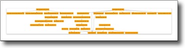
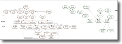
It is actually very close to what I wanted. However, the beauty of a programme such as Graphviz is that I can change the chart from hierarchical to circular or to a radial arrangement with a click and see what happens. A radial chart of the same info looks like this:
Which is actually rather cool as you can immediately see apparent clustering of groups and this is the primary reason that automated relationship visualisation tools are useful.
As I mentioned, in most cases you’ll be happy very quickly with what you need from Graphviz and it has the huge bonus of being free. Unfortunately, as a graphic editor, its is less powerful than other dedicated programmes out there. It is also very focussed on demonstrating relationships for your own analysis as opposed to making them ravishingly pretty for further presentation.
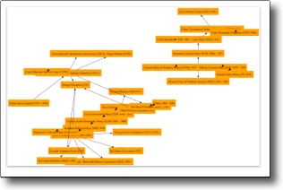
And so we come back to OmniGraffle. As I had simply started drawing objects and not approached the original task by defining my data as consisting of a series of relationships, I was limited to the haphazard construction of objects I drew. Now that I was armed with a documented list of relationships conforming to a standard for interchange, I had a greatly enhanced the range of presentation options open to me. Omnigraffle reads .dot files natively, so I was able to save the few changes I made in Graphviz as a .dot file and read this file directly into Omnigraffle. In OG, I am able to select one of a series of nodes and can radically alter their appearance. I am also able to drag nodes about, all the while maintaining their relationships. I can operate on nodes and edges independently and most important to my needs, be able do ll this while retaining the ability to apply automatic transformations to the chart as a whole for analytical purposes. Thus, I was able to embellish the chart I was interested in having by adding additional summary graphics such as creating a box around suspected related groups of organizations that aren’t easily represented in standardized graph theory. The resulting chart looks like this:
If you click on the small graphic here, it will link to the chart as a PDF so you can actually read the names. It’s still a work in process, but I am now able to start to make some sense of all the different organizations which are mentioned in the text I am working through. In a perfect world, this would actually be applicable to my dissertation work as well, as opposed to squirreling away a few precious hours of time I should be spending on writing about Canadian tavernkeepers 😉
Hopefully this provides a little bit of insight a to what tools are easily accessible to take relationships and represent them visually – tools which don’t demand that you learn the finer points of graph theory, but do in fact allow you leverage them to appreciate the intricacies of large social networks.
Nice, Shawn… I’ll have to check out OmniGraffle. I’ve been thinking it would be cool to have a dynamic network browser that rendered a portion of the network and let you zoom through it. Ideally this would be something like a web service or applet that could parse DOT files.