
 Today I had a wonderful discussion with Fernanda Viégas and Martin Wattenberg of IBM’s Visual Communications Lab. These are the fine folks behind the Many Eyes website that I blogged about a few months ago. Since launching their site, they have been hard at work bringing us new means of visualizing datasets and providing a social network for dataheads. My earlier article I spoke glowingly of the attention to detail that the site exhibited and wealth of charting opportunities offered. I also promised I would play more with the site.
In the last few months I have had an opportunity to just that. I have also been pleased to see some of the additions to the tools available on the site. Most recently I was thrilled to discover that Martin had been playing with some of the data that I had uploaded and in conjunction with one of their interns Lee Byron. They came up with a wonderful flash-based tool to produce interactive matrix charts allowing simultaneous representation of three vectors of data. In their blog article on the new tool, Martin demonstrates the results that can be achieved using my data on the 17th Parliament of Canada.
They have also implemented a feature called Topic Hubs that allow for loose associations of related datasets and visualization to encourage discussion. I was gratified to hear that they have some more exciting additions up their sleeves and that they will be rolling these out shortly.
I have benefited from the Many Eyes tools in my own work by gaining access to some innovative charting tools such as bubble charts an tree charts that have helped me to gain insights into my own data that remain hidden to me in numerical tables. I used the Many Eyes tools extensively in the production of the blog entries on MPs Occupations. To create these visualizations, I went to the Government of Canada website and screen scraped data on individual MPs from a set of specific sessions of Canadian Parliament. I entered this data into Excel for tidying and manipulation and then uploaded these tables to Many Eyes. Their tools produced superb tree charts with limited input. Although their tools produced very pretty charts, I needed to do further graphical manipulation, so I did screen captures and further polished the charts in Adobe illustrator before embedding the results in the blog posts. I am told that export is an area where we will see some enhancement on the Many Eyes kitbag.
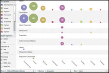
The chart below is an example of the new Matrix chart that Many Eyes can produce. I uploaded a slightly enhanced dataset of occupations of the members of the first Canadian parliament with members delineated by party, constituency, occupation and province. I then chose Matrixchart and played around with data placement using the handy new popup choice fields in the tool. The results are shown below. Clicking on the chart will take you to the many Eyes site where you can try playing with this dataset of any of the other ones contributed by members.


Many Eyes is a wonderful tool for those that find data fascinating or better appreciate data when it is presented visually. Keep tuned to their blog for exciting enhancements and thanks to all involved at the Visual Communications lab for all the hard work and vision behind these tools.