 I have mentioned the Exhibit project out of the Semantic Interoperability of Metadata and Information in unLike Enviroments (SIMILE) lab at MIT. Their Timeline project was one that I immediately was interested in. It takes and XML of JSON feed and creates a graphical animated chronological timeline. I threw 450 events from the life of Napoleon at it for fun and was quite pleased with the results. A couple months back they introduced Exhibit which allows a user to quickly and efficiently display a JSON dataset in a variety of flexible formats including searchable tables, Goggle maps, and the Timeline format above. Or as they state:
Exhibit is a lightweight structured data publishing framework that lets you create web pages with support for sorting, filtering, and rich visualizations by writing only HTML and optionally some CSS and Javascript code.
It’s like Google Maps and Timeline, but for structured data normally published through database-backed web sites. Exhibit essentially removes the need for a database or a server side web application. Its Javascript-based engine makes it easy for everyone who has a little bit of knowledge of HTML and small data sets to share them with the world and let people easily interact with them.
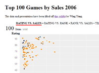
 The beauty of this scheme is that it is a client side framework and approachable by anyone wishing to share their data and requires little knowledge of javascript or the like. Its quite robust and extensible. In fact, over the past week, the developer added scattercharts to the mix and the framework continues to evolve very quickly. In fact, the developer has been soliciting comments on users needs for future development. There’s a very active development community growing around this product.